Graphic Designers, Flush Left?
"There are two sorts of people in the information-age elite, spreadsheet people and paragraph people," wrote Brooks. "Spreadsheet people work with numbers, wear loafers and support Republicans. Paragraph people work with prose, don't shine their shoes as often as they should and back Democrats." He went on to point out that "C.E.O.'s are classic spreadsheet people," five times more likely to donate to Bush than Kerry, and "Professors, on the other hand, are classic paragraph people," with Kerry donors outnumbering Bush donors eleven to one.
Are graphic designers spreadsheet people, paragraph people, or something else altogether? Where do we fall on the political spectrum? Do we even have to ask?
Paragraph people or number people, most of the designers I know lean left. My perspective may be skewed: I practice, after all, in a city where Democrats outnumber Republicans five to one. Yet judged by their poster projects ,manifestos and t-shirt contests , there is plenty of evidence that this is more than a local anomaly. Brooks posits an "intellectual affiliation theory." Number people, reassured by the "false clarity that numbers imply," respond to Bush's simple (minded?) decisiveness; paragraph people like the "postmodern, post-Cartesian, deconstructionist, co-directional ambiguity of Kerry's Iraq policy."
This makes sense. Graphic designers largely operate in a world of ambiguity, and with their antipathy to focus group testing and double-entry bookkeeping, most are definitely not number people.
This left-wing bias has deep historic roots. So much modern graphic design traces its roots back to the typographic innovations of the avant-garde work of early Soviet designers like Lissitzky, Rodchenko, Stepanova and the Stenberg Brothers. Pioneering American graphic designers like Paul Rand, Charles Coiner and Lester Beall were nurtured in the crucible of FDR's New Deal and the anti-Fascist fervor of the late thirties.
On the other hand, the most devastatingly effective design program of the twentieth century was commissioned by Adolf Hitler. A rigorously applied graphic identity, potent event planning, single minded architectural design: no design detail was too petty for the Third Reich, even (in a weird echo of this moment's obsession with the political uses of vintage office equipment) the customization of typewriters, each one of which was fitted out with a key that would render the twin lightning bolt logo of the SS. Based on the historical record, might Brooks be tempted to further sort out corporate identity designers on the right, and poster designers on the left?
Some professionals feel that design and politics shouldn't mix. After Bill Drenttel posted his unashamedly partisan article on the Bush National Guard documents controversy, Adrian Hanft wrote, "Time after time this blog pushes its political agenda and I am tired of it...I am baffled as to why you can't stick to the issue that you are good at: observing design." On the blog he runs with a group of writers including Bennett Holzworth, Hanft makes their own position clear: "Politics is not off limits, but when the topic comes up, you can be sure we are talking about design, and not pushing an agenda or endorsing a candidate. Doing so can only lessen the impact of our design discussion. We are professional graphic designers who have dedicated our lives to design, not politics. You don't care what our political views are, do you?"
Well, actually, I do. Many subsequent writers seemed to assume that Hanft and Holzworth were writing from a pro-Bush position but, true to form, they never disclosed their own leanings. I for one would like to hear from more conservative designers, if they truly exist. One of the few is Christian Robertson, who described himself as "one of the few registered Republican typoholics" while posting on Typographica. "The one thing I take from this," he wrote about the Bush documents controversy, "is that you can't underestimate the power of political/cultural identity in shaping thought. In all of the blogs, news stories, newspaper articles, and cable 'shout shows' I've seen in the past couple days (and believe me, I've seen a lot of them), almost never did anyone support a view that crossed their team affiliation. People will sometimes grudgingly change their view, but it takes a true preponderance of evidence."
I would add that you can't underestimate the power of political and cultural identity in shaping design as well. As much you might like to separate your political beliefs from your professional life, in the end it's folly. Satirist Tom Lehrerput it best in his song about mid-century America's most notorious non-ideological specialist, Werner von Braun, the Nazi weapons expert who joined the postwar space race as a designer for NASA:
Once the rockets are up, who cares where they come down?
That's not my department, says Werner von Braun.
We can try to departmentalize our lives, but it's impossible. Graphic designers work with messages, and the messages mean something. We may think we're responsible only for launching those messages, and certainly there's some comfort (and profit) in thinking that. But if you care about your work, you have to care not only about how it goes up, but where you come down.
Initial research questions
After reading this essay several times i decided to go into the theme of politics for my essay. Below are quotes taken from the essay which talk about politics and where designers stand.
"Politics is not off limits, but when the topic comes up, you can be sure we are talking about design, and not pushing an agenda or endorsing a candidate. Doing so can only lessen the impact of our design discussion. We are professional graphic designers who have dedicated our lives to design, not politics. You don't care what our political views are, do you?"
"I would add that you can't underestimate the power of political and cultural identity in shaping design as well. As much you might like to separate your political beliefs from your professional life, in the end it's folly."
Research Questions
What role had graphic design played on political propaganda and what role does it continue to play?
What is the relationship between graphic design and politics?
Considering aesthetics and historical propaganda, how much of an influence does war have on street artist?
(question which i will use u)
Research
I decided to look into Edward L. Bernays as he was a very key figure when it came to propaganda and the relationship he had with the public. "The public mind in the making " is a book which i will need to read.
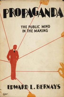 | Propaganda, an influential book written by Edward L. Bernays in 1928, incorporated the literature from social science and psychological manipulation into an examination of the techniques of public communication. Bernays wrote the book in response to the success of some of his earlier works such as Crystallizing Public Opinion (1923) and A Public Relations Counsel (1927). Propaganda explored the psychology behind manipulating masses and the ability to use symbolic action and propaganda to influence politics, effect social change, and lobby for gender and racial equality. Walter Lippman was Bernays’ unacknowledged American mentor and his work The Phantom Public greatly influenced the ideas expressed in Propaganda a year later. The work propelled Bernays into media historians’ view of him as the “father of public relations.” |
Quotes from book
The quotes below are key quotes which interested me on the view Bernays had with propaganda. I cal also use these quotes for my essay and see the correlation it had with war propaganda.
- "Propaganda is the executive arm of the invisible government."
- “The conscious and intelligent manipulation of the organized habits and opinions of the masses is an important element in democratic society. Those who manipulate this unseen mechanism of society constitute an invisible government which is the true ruling power of our country. ...We are governed, our minds are molded, our tastes formed, our ideas suggested, largely by men we have never heard of. This is a logical result of the way in which our democratic society is organized. Vast numbers of human beings must cooperate in this manner if they are to live together as a smoothly functioning society. ...In almost every act of our daily lives, whether in the sphere of politics or business, in our social conduct or our ethical thinking, we are dominated by the relatively small number of persons...who understand the mental processes and social patterns of the masses. It is they who pull the wires which control the public mind.”
- The conscious and intelligent manipulation of the organized habits and opinions of the masses is an important element in democratic society. Those who manipulate this unseen mechanism of society constitute an invisible government which is the true ruling power of our country.
- Human desires are the steam which makes the social machine work. Only by understanding them can the propagandist control that vast, loose-jointed mechanism which is modern society.
- Propaganda will never die out. Intelligent men must realize that propaganda is the modern instrument by which they can fight for productive ends and help to bring order out of chaos.
- I believe that competition in the future will not be only an advertising competition between individual products or between big associations, but that it will in addition be a competition of propaganda.
- Small groups of persons can, and do, make the rest of us think what they please about a given subject. But there are usually proponents and opponents of every propaganda, both of whom are equally eager to convince the majority.
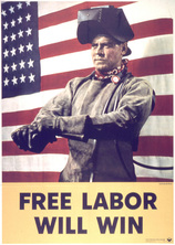
These are some of the posters which Bernays refers to when making his quotes.
War propaganda posters
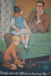 | This poster was produced before conscription was introduced in 1916 and aimed to encourage men to join the armed forces through emotional blackmail. |
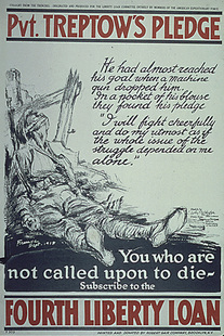 | Pvt Treptow died on the battle fields during the First World War, however, a note was found in his pocket which became the content for a political poster. |
 | This poster was created during the First World War to encourage the people of America to stick together during the war effort. |
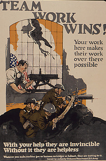
 | This poster was created by the American Office for Emergency Management during World War Two and encourages everybody to stick together. |
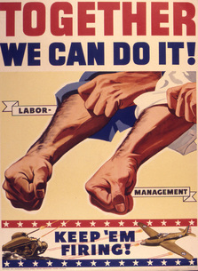
 | Another political poster from World War Two created by the Office For Emergency Management. |
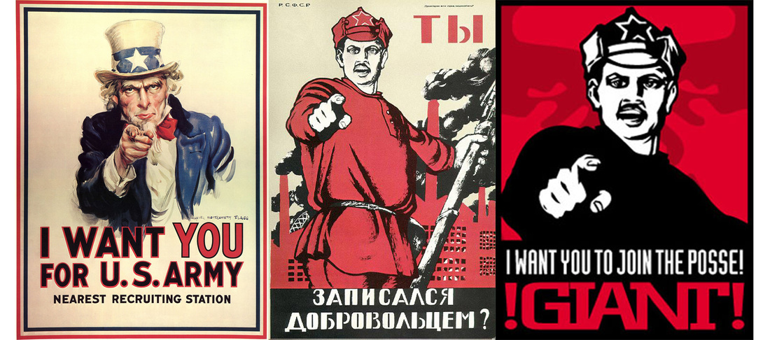
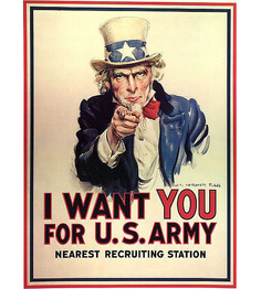 | Uncle Sam (initials U.S.) is a common national personification of the American government that, ,came into use during the War of 1812 and was supposedly named for Samuel Wilson. It had a very huge impact on the public. |
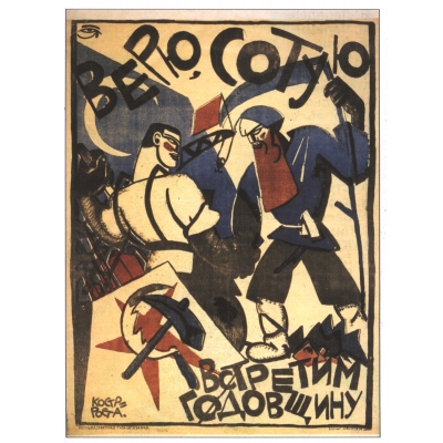 | This early Russian revolutionary poster, "Believe, will celebrate the hundredth anniversary," is one of the many posters that used modernism as was practiced by Fernand Léger , Marc Chagall and others. |
From the posters I have gathered how design has been such a powerful too.By using effective visual communication while appealing to people's emotions you can control people's actions. The above posters show a prime example of this. Not only are these posters great examples of the graphic art of the time, they also reflect the culture. The governments needed something of the public. Good or bad, they were motivated to get what they needed and these posters, as well as many more, helped them achieve that.
Based on my initial research into political graphic design I decided to look more investigate and analyse high impact posters that conveyed a political/social message.
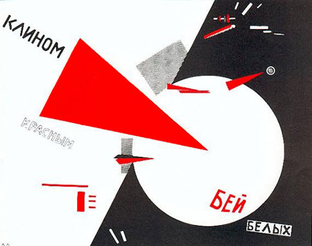
Designed in 1919 the poster above symbolises the Russian civil war. In the poster, the intrusive red wedge symbolises the bolsheviks, who are penetrating and defeating their opponents, the white movement. The design defines the Constructivism art movement, which manifested itself as a rejection of autonomous and saw art as a tool for social purposes.
The design focuses on the idea of abstraction to deliver its intended message. Bold yet simple geometric shapes give the design its form. The composition is structured and organised with the red triangle and white circle being the focal point. The positioning of the triangle evokes movement and action, ultimately this is the message the designer wants to communicate. Smaller, more minimal shapes have been arranged around the focal point. This acts to give the illusion that of breaking and shattering fragments of the white and red, again this links into the idea of upheaval. The limited colour also gives the design a higher impact. In using a vibrant red the audiences attention is drawn to the focal point, this directly contrasts against the white and black. Red is symbolic as it has connotations with revolution and uprising. The use of typography is minimal, as the image acts to convey the message. What makes this design so effective is the use of colour and basic geometric shape to illustrate political ideology.
The design focuses on the idea of abstraction to deliver its intended message. Bold yet simple geometric shapes give the design its form. The composition is structured and organised with the red triangle and white circle being the focal point. The positioning of the triangle evokes movement and action, ultimately this is the message the designer wants to communicate. Smaller, more minimal shapes have been arranged around the focal point. This acts to give the illusion that of breaking and shattering fragments of the white and red, again this links into the idea of upheaval. The limited colour also gives the design a higher impact. In using a vibrant red the audiences attention is drawn to the focal point, this directly contrasts against the white and black. Red is symbolic as it has connotations with revolution and uprising. The use of typography is minimal, as the image acts to convey the message. What makes this design so effective is the use of colour and basic geometric shape to illustrate political ideology.
| | Looking at this video, the things that stood out to me the most, what they said was that they say all the look as if they tell some sort of story, and its quite comic book like. The message that they say propaganda tries to tell the public, is said to have Which tells me more about how the propaganda method brainwashed people in a way, to believe in what the government wanted people to think was right and what shouldn’t be aloud. |
| Looking at another video.I noticed that they used the propaganda method to show the City of London. They used influential sayings and quotes like propaganda in WW1 and WW2 use, and that is why I know that they used that method. The quote that stood out to me the most was "you can do it"this is because they use the same technique to persuade others and make them feel as if they can do things, which could possibly make them feel like they have achieved something, like how someone in WW1 or WW2 time, could feel like they have helped and have become some type of hero, for doing what the propaganda posters tell them.  | |
| https://books.google.co.uk/books?id=WUEv45FsrmsC&pg=PA116&lpg=PA116&dq=graphic+design+and+world+war&source=bl&ots=tDxy4v63Q7&sig=FsP0WJLNcyJcJSs1vZSj26SwO6Q&hl=en&sa=X&ei=SYPSVMC6GKO27gbRm4HoAQ&ved=0CEwQ6AEwBw#v=onepage&q=graphic%20design%20and%20world%20war&f=false | This book gave me a good understanding on the historical posters used during war and also gives analysis on how they impacted the public. |
Refrences taken from the book
- propaganda started during WW1
- It started in Russia
- Was it used in WW1? It could have been when the printing press was invented to make things alot easier
- Russian Revolution was in 1919 and this was when propaganda was used greatly
- Propaganda made more people join the army
- Not joining the army made other people look down on them and made them feel guilty
- Everybody believed that the government was right at this time
- I believe that propaganda, must have been an effective method as it is still used today
- Propaganda makes personal persuasive arguments and messages.
- propaganda tried to get people to believe in political views and help out during the war by manipulating men to join the army
- They wanted to send emotional messages to get the point across and give a bigger impact
- Graphic Design had a big influence in WW1 and the revolution of Russia
- The invention of printing press, made things easier to publisise the types of posters
- Propaganda posters have played a large role throughout the modern history andwere the primary media of political and social communication.
- Media and mass persuasion influence the public by using images of war, disastrous events and other compromising material.
- Even though people are becoming more aware of the means of persuasion by being presented with massive amounts of information , propaganda is still being perceived negatively reflecting on its use in history.
Soviet Propoganda Influences Western Art, Advertising & Design
 | 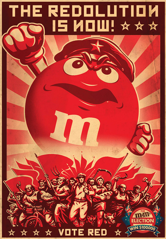 |
The nfluence of Soviet style propaganda being seen in contemporary art, graphic design and advertising in western culture. Bold prints and illustrations reminiscent of the posters produced in the Soviet Union in the early 1900’s have been appearing in magazine ads, billboards, street murals, galleries and art fairs. This style has become so popular that the advertising agency Clemenger BBDO decided to use it in their M & M, “The Redolution is now!” ad campaign.
http://www.blackdogadvertising.com/miami-advertising-blog/propoganda-poster#sthash.dM1305DR.dpuf
http://www.blackdogadvertising.com/miami-advertising-blog/propoganda-poster#sthash.dM1305DR.dpuf
 | http://articles.chicagotribune.com/2001-06-03/entertainment/0106030063_1_graphic-design-bauhaus-politics |
 | http://naskin.typepad.com/grafisch_ontwerp_en_meer/2012/06/the-power-of-propaganda.html |
 | http://www.cruzine.com/2010/09/16/design-propaganda/ |
Influence of graphic design on society
“The effect of design is seen in other examples within modern popular culture. The idea of living an environmentally sustainable lifestyle has existed for decades, but it wasn’t until graphic designers joined the movement, when they helped to create a worldwide phenomenon.”, statesVu Nguyen in his blog: Design and Globalization: How graphic design can inspire global culture.
Design is part of a global language. Visuals affect people’s way of thinking. It’s a universal language that affects our beliefs, our ideas, our values and our sometimes, even our actions. Graphic design can impact a person’s emotions by installing anger, happiness or empathy in a design.
Nguyen explains how graphic design is most powerful in politics. He predicts that we will see a movement in design this year because it’s a campaign year. We’ll be witnesses to changes and new trends based solely on politician’s choice of design. It is then when we will also witness the power that graphic design has over our thinking. People will decide whose side they’re on. Graphic design will be a significant
influence in that decision."https://gra617.expressions.syr.edu/blog/2011/07/22/influence-of-graphic-design-this-coming-year/
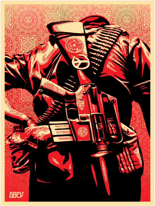
Shepard Fairey's work
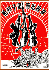
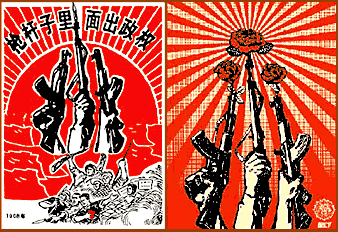
'Political Power Comes From The Barrel of A Gun' - Artist Unknown - 1968
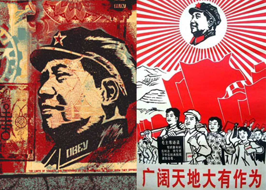
This Shepard Fairey piece is one of his best known imitations. He took the image of the hands holding the guns from the ‘Political Power…Gun’ piece. This caused an uproar with many artists who ridicule his work and say that “his work sets a standard that is ultimately damaging to art“. Lots of Fairey’s art imitates the stylings of Chinese revolution propaganda, like the image above. Other examples http://www.art-for-a-change.com/Obey/index.htm
This Shepard Fairey piece is one of his best known imitations. He took the image of the hands holding the guns from the ‘Political Power…Gun’ piece. This caused an uproar with many artists who ridicule his work and say that “his work sets a standard that is ultimately damaging to art“. Lots of Fairey’s art imitates the stylings of Chinese revolution propaganda, like the image above. Other examples http://www.art-for-a-change.com/Obey/index.htm
Feedback from tutorial 29/01/15
29/01/15
Again a very big question. Again you need to break down the question. You will need to understand what it is you really want to talk about. What do you mean by politics? Do you mean governments? Do you mean campaigns? So propaganda stuff? So more around propaganda stuff. So Again Edward L. Bernays. Very key figure when it comes to propaganda and its relationship between propaganda and public.
See those are very different things I would again recommend it’s a 2000 words essay.you aren’t going to be able to cover the ground from world war 2 to now. So I would recommend either to look particularly at World War 2 and the relationship we had with propaganda either from a contemporary point of view or really focus particularly deeply on what that meant for that time period. Remember you don’t have to talk about something that is current. You can choose “I am looking at war propaganda and the idea of propaganda and politics from 1930 to 1945. That’s fees able for tittle. If you’re talking widely about politics and graphic design.
Possible Comparisons for essay
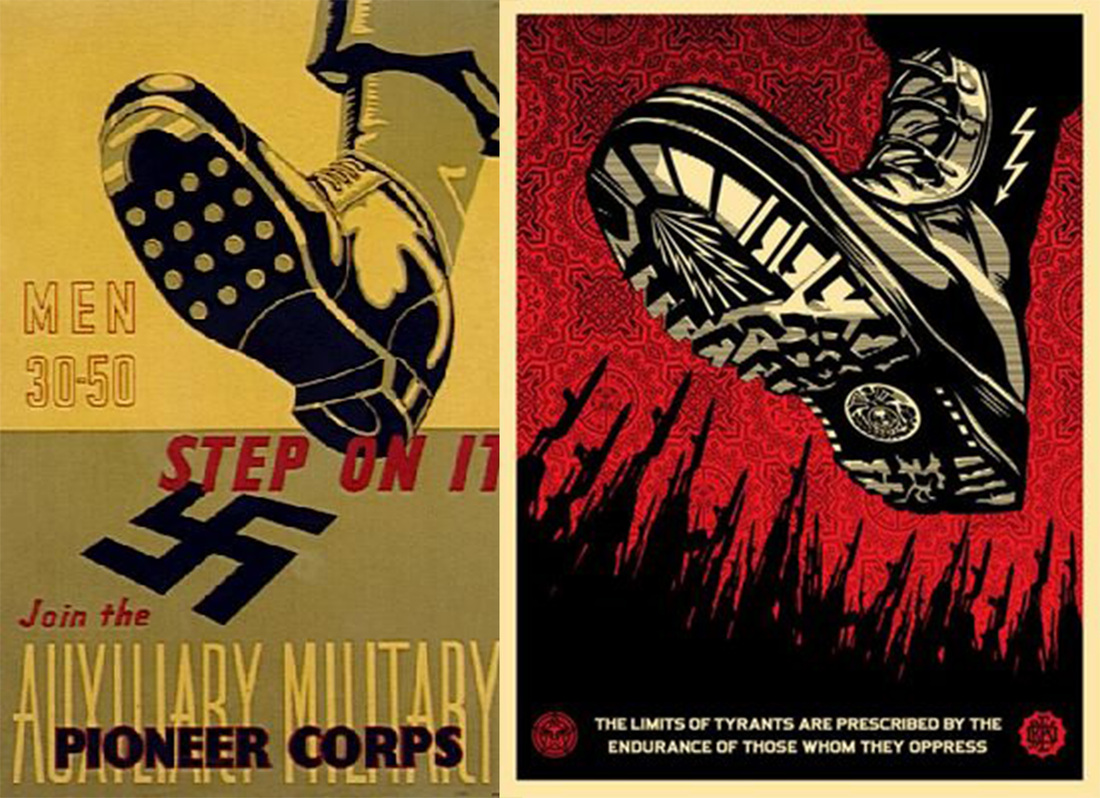
I have done research on imitations Fairey has created. I will talking about some of these in the essay, How he imitates them but gives it a different meaning. I will also try to talk about how other artworks of Fairey’s resonates other propaganda due to the colour scheme and angular text and images he uses. I researched about Soviet posters and below are the images. On the right Fairey’s work which seem to have come from influence taken from the posters on the right. http://www.sovietposters.com/ more images on this link.
 | |
| This is the iconic Barack Obama ‘Hope’ poster Designed by artist Shepard Fairey. The poster is a stylised pencil drawing of Obama in colours very unusual to be used in modern day/politics. It was made to look from early 20th Century, in the era of the propaganda posters. The poster uses the same 3 colours used on most propaganda posters by the US Government during the Second World War. The pop art and pencil Style is what makes the poster stand out, with also the facial expression by the President making you believe that there is “Hope”. "Propaganda is a style of communication with political intent, utilizing emotion and suggestion to sway opinion and action. It can be misleading but not always as seen by the hope poster as it became a touchstone for people around the world who supported Obama's agenda." A quote taken about Obama work "They are really effective because they are designed to elicit emotional reactions.Many of the graphic designers in the bellicose countries believed in the message they were delivering, and used a variety of modern techniques in their designs. This is true for many of the designers who design politically, whether it is for the government or not." | 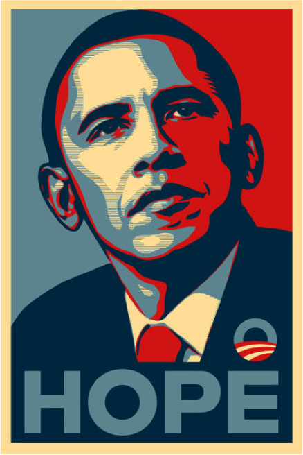 |
Final Feedback from tutorial
You could do like a straight contrast with someone like banksy and sphered ferry. They both are street artist, they both have this political message, but they do it in a very different way, the public preserve them in a very different way, this is very much involved literally in politics, banksy is much more critiquing politics. So you could do something like that. So question in something like “from infunlances during world war 2 today we have street artist which reference genre or aesthetic of political propaganda to what effect? “or Something across that like . Or what I had in mind was “how contemporary artist portray political messages in reference to historical propaganda”. you can bring these in as your beginning paragraph. You start off with a paragraph with contemporary artist do it like this but this is where this kind of comes from and this is the way in which it is moved forwarded and it was these things and now it’s this kind of social critic and we have these prominent figures banksy and shpered ferry and this is my comparison and analysis of these two and the conclusion would be well what is the impact of this to today’s society.
Edward Winkleman’s blog “Good Political Art”
http://www.edwardwinkleman.com/2006/05/good-political-art.html
"On the thread about Stephen Colbert, someone asked:
Apropos your 1st point--it's true--we all individually contain a "middle" and a "right" to some degree--even if you just look at it in terms of the milieu in which we were each brought up--and I just read your thing about purple art--somehow the work must acknowledge this bundle of contradictions to go deeper than a one-liner. Do you have a couple of examples of visual art that you think succeed on this level?I've been thinking about that for a few days now, wanting to offer good examples that illustrate what I expect from "political art" but before I get to those choices, I want to highlight an important distinction. Over the weekend Luc Tuymans came up, and someone asked if his last exhibition at Zwirner represented good political art. Not for me. It's good art. I love his paintings, but just because the subject matter was people in politics, doesn't make the work good political art. Tuyman's exhibition succeeded more for me as an exploration of how memory works than any insightful critique of the Bush administration. Harking back to my post on Loathing Fear, there's nothing Tuyman's pointing out about the precariousness of our situation that wasn't the case before Bush came to power and before 9/11. But they are awesome paintings. For me though they're not great "political art."
I should also note that to me good political art is extraordinarily difficult. Politics is a field where the enthusiasts emerse themselves in the minutiae of every aspect of it--they know the arguments, the counter arguments, and the counter-counter arguments, as well as their weaknesses--so an artist has to know the subject matter inside out to make work that's both insightful (i.e., revealing something profound and new) and universal at that same time, which is more or less my expectation from "good art."
So who does it? The best example I can think of is William Kentridge (here's a Quicktime snippet of 6 Soho Ecksteinsomeone put online), and why is as simple as quoting the great man himself:
I have never tried to make illustrations of apartheid, but the drawings and films are certainly spawned by and feed off the brutalized society left in its wake. I am interested in a political art, that is to say an art of ambiguity, contradiction, uncompleted gestures, and certain endings; an art (and a politics) in which optimism is kept in check and nihilism at bay. - William Kentridge [emphasis mine]And why is political art one of ambiguity, contradiction, uncompleted gestures and certain endings? Because that defines the human condition that politics exist to deal with in the first place, and that's what political art must express to be good. That's why work that's all bravado, "Bush sucks, don't ya know it," and sure of itself fails. How could anything as complex as an opinion about politics be that cocksure? As Kentridge points out, the only thing that's ever certain within the realm of politics is how something ends.
Here's an current world example of why I think this all matters. It took me about two years to finally see what a wise and much older blogger on a right wing site was trying to get me to see about the invasion of Iraq. His point, through tons of abuse by me and evidence to the contrary in the papers every day, was that invading Iraq may yet play out to be seen as a grandly generous and selfless gift to the nation by our president. At some point in the distant future, school children may read in History class of how that difficult decision saved the country from certain disaster. Not being privvy to the information the president has, we honestly just don't know at this point. We can, given the information at hand, declare it was a mistake to invade (and I do), but in the back of my mind is this idea tucked away to keep an open mind, look for details about a much more dire future had we not invaded.
In the end, it's the president's job to protect this country, first and foremost. Perhaps that's what Bush was/is sure he is doing, honestly. Personally, I don't think so, but any exploration of the issue that dismisses such a possibility out of hand cannot do justice to the issue, and therefore would not make for "good" political art.
But who else? Whose political art reveals the "truth" by being as complex as the issues that serve as its subject?"
Other artist who work with politics
Warhol's Political work
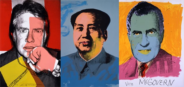
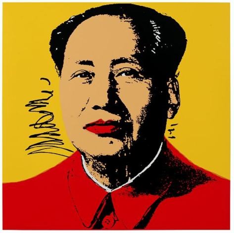
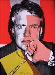
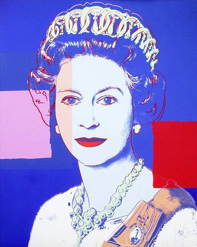
Above are some of Andy Warhol work. His work is famous as its desire to break political and social barriers with his art. He perhaps is trying to say a political message by the way in which he has done the art work.
He has used strong shapes of colour in all the above work. I love his choice of colour & shape and positioning seem to be used with a meaning behind it. The tone on the government queen piece creates the tone of the tone we see. E.g on bank notes and in photo's /television. The colours all look so bright and consistent which counteract the roughness of shape and line.
He has used strong shapes of colour in all the above work. I love his choice of colour & shape and positioning seem to be used with a meaning behind it. The tone on the government queen piece creates the tone of the tone we see. E.g on bank notes and in photo's /television. The colours all look so bright and consistent which counteract the roughness of shape and line.
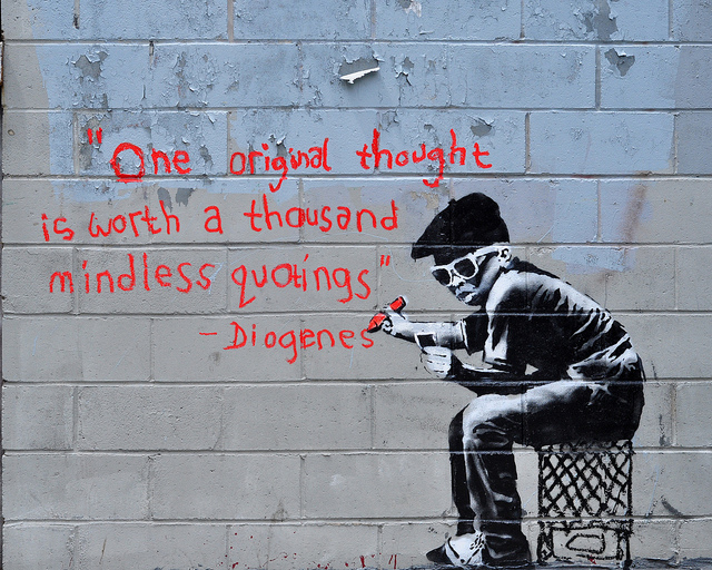
Banksys political work
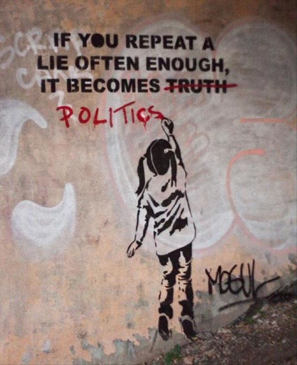
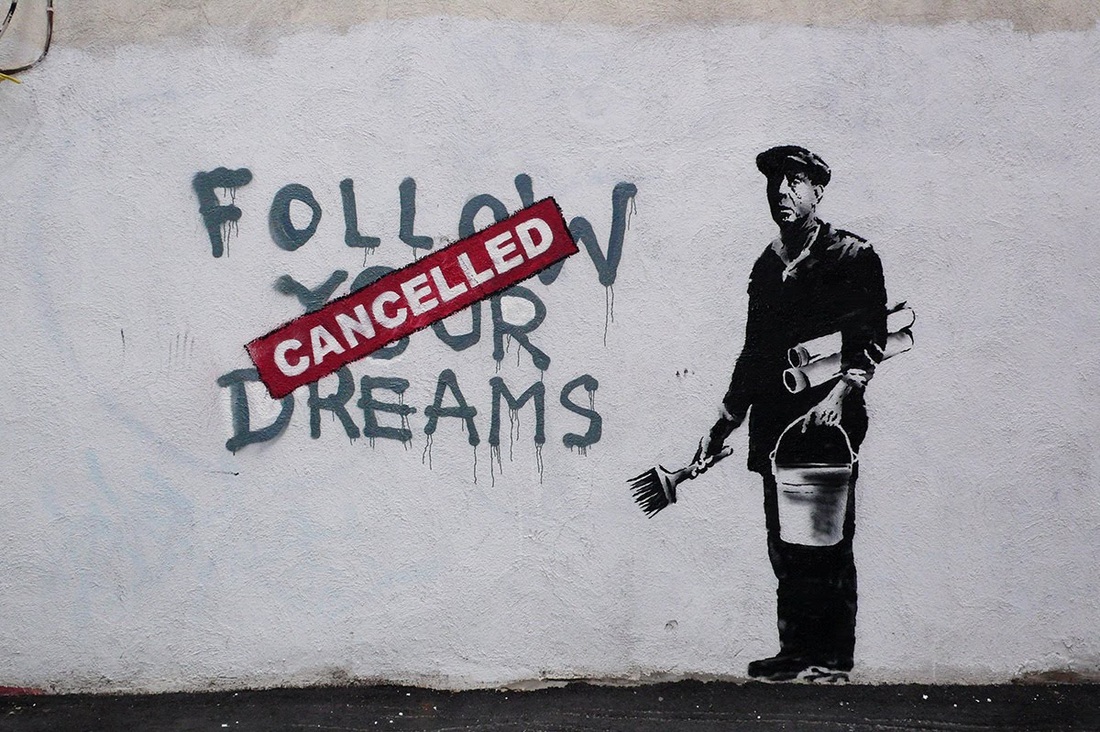
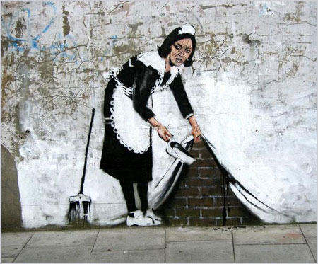
Banksy is the most widely recognised street artist is England based His work has been becoming increasingly better known possibly due to the controversy surrounding it, alot of his work send out political messages about the economy ,government and politics. He is often very forthcoming with his opinion and shows this in his graffiti, his images are simple yet send quite a strong message to the public. Banksy would perhaps be a better artist to look into when compering work with fariey's as they both do the similar thing.
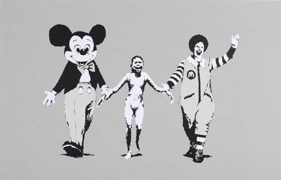 | In an attack on consumerism, Banksy created Napalm Girl in 2004. It features a reproduction of an iconic photograph of a young girl during a napalm bombing in Vietnam in the seventies. In Banksy’s version the terrified naked girl is caught between Ronald McDonald and Mickey Mouse. |
 | The little girl is seen frisking an armed soldier in a stark reversal of roles.It also link with the conflict which was taking place in Bethlehem. |
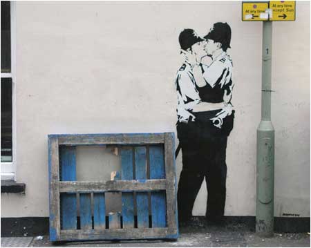 | Image appeared on a pub wall in Brighton, UK in 2004, Banksy’s “Kissing Coppers” was a a piece that was one in the eye for the for the police (who Banksy frequently taunts) as well as to homophobes. The siting of this graffiti was probably most deliberate given that Brighton is well-known for its large gay population. |
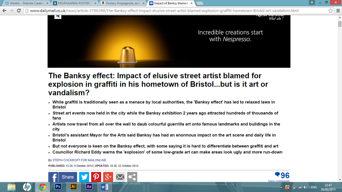 | A news article which talks about the impact banksy had on society. It also looks into other artist who has taken influence from his work. http://www.dailymail.co.uk/news/article-2786398/The-Banksy-effect-Impact-elusive-street-artist-blamed-explosion-graffiti-hometown-Bristol-art-vandalism.html |
Structure for essay
Introduction
Historical propaganda that influenced society
-key images of propaganda poster
-link some of barneys quotes
The influence war propaganda had on Shepard fairey
-compare the work which he does with he takes from war
Banksy’s impact on political propaganda
-his work,what it means
What influences do theses artist have on today’s society?
-impact these work has on society,what it means and also how the public see it. Appendix References
 RSS Feed